ATHE
The Challenge
The Association for Theatre in Higher Education (ATHE) website was confusing to navigate because menu options had been added piecemeal over time. While many members of the organization had difficulty navigating the website, no one had been able to articulate a plan to fix it.
The Approach
|
A team of four ATHE members from the Electronic Technology committee met to evaluate the website.
The group discussed the ways we, as ATHE members, regularly use the website. Then we developed personas that represented current and potential ATHE members who would have different needs than the four of us. We listed the tasks these users would most likely come to the website to accomplish. Here are a few examples we created using the SITUATION, MOTIVATION, EXPECTED OUTCOME model:
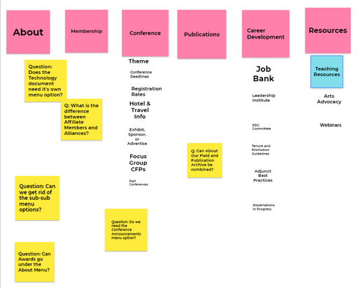
We then attempted to perform typical user tasks on the website, finding potential pain points. I then led the team in a collaborative closed card-sorting activity to edit the website’s menu. We used a Jamboard to sort digital sticky notes into the existing menu categories. |
The Results
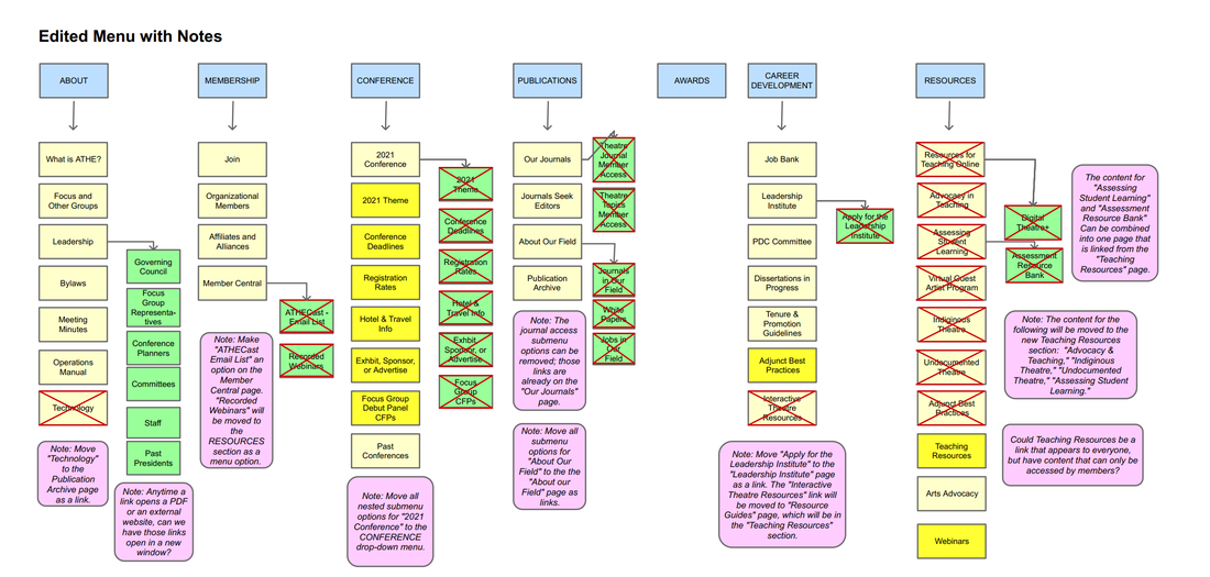
 The sitemap I created featuring a clear, streamlined menu.
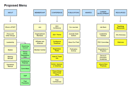
After analyzing the team’s findings, I designed a new, simplified menu and eliminated unnecessary nested submenus. Using Pencil, I created an interactive map of the new menu that clearly demonstrated which menu items should be removed, which should be added, and which should be moved elsewhere. The team and I created a plan for a new section of the website called Teaching Resources, which would feature sections of organized teaching resources for members. The committee chair and I pitched our suggestions to the Data Manager who facilitates the website. He enthusiastically agreed to make the changes.

